Streamlining ticket booking flow
Indian Railways e-ticketing website that offers train ticket booking and related services
Overview
The Indian government's push towards digitization and online services has led to a growing demand for online train ticket booking services, with the IRCTC (Indian Railway Catering and Tourism Corporation ) website being the primary platform for such bookings. It is one of India's most frequently visited websites, attracting over 52.1 million monthly visits as of September 2022. Despite its widespread use, the website often frustrates users with its poor user experience.
Goal
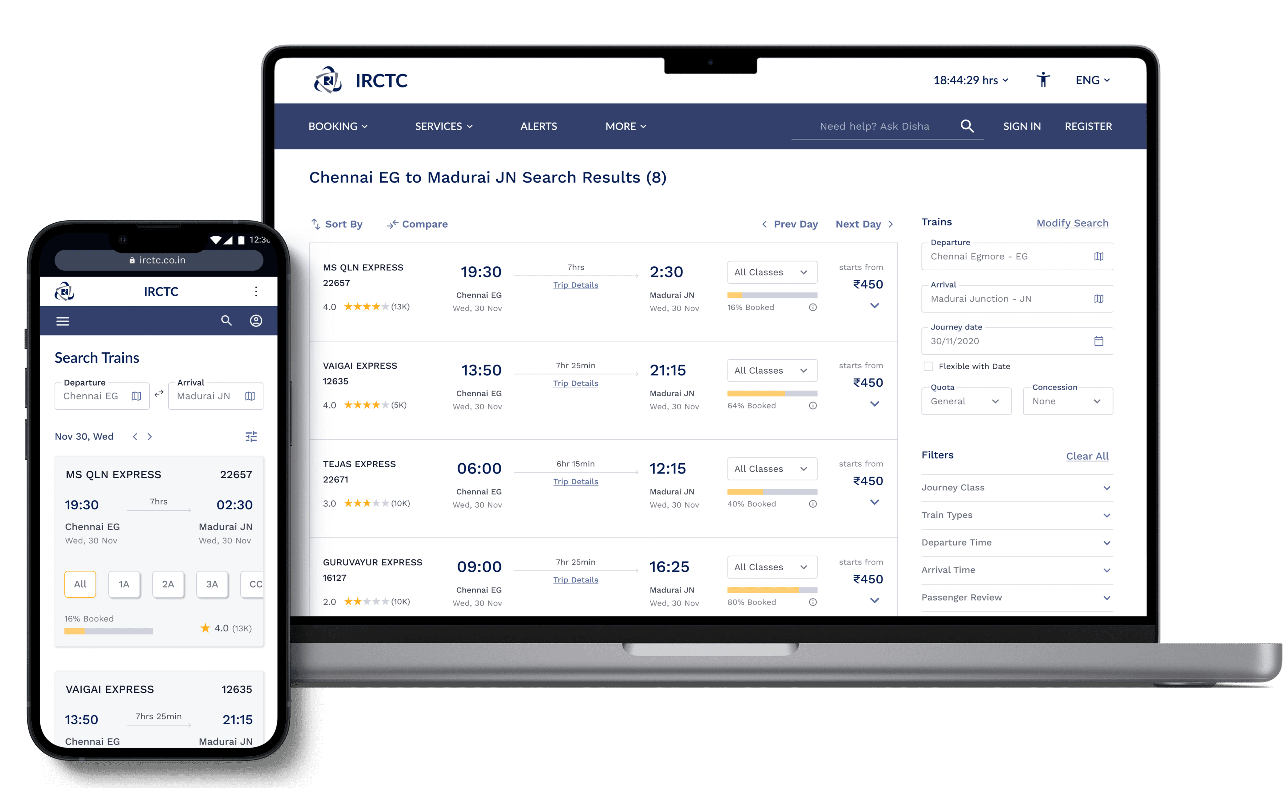
The project aims to provide an improved user experience for IRCTC customers by streamlining the train ticket booking process and implementing a responsive redesign for their e-ticket booking website.
How might we improve the website's user experience to ensure a seamless booking process for IRCTC customers?
Research and Analyze
Booking woes amidst a growing user base
India's online travel market is expected to reach $125 billion by 2025, up from $39 billion in 2020, with train ticket bookings being a significant part. (Source: Google and Boston Consulting Group)
According to a survey conducted by Indian consumer research firm Velocity MR, nearly 70% of IRCTC users face difficulties booking tickets on the website. (Source: Velocity MR)
Understanding the travel booking process
Through an extensive analysis of well-established e-ticket booking websites like EaseMyTrip, Booking.com, and Amtrak, I acquired a comprehensive understanding of the travel booking process, identified crucial elements for ensuring a positive user experience, and recognized the key features that contribute to their success.
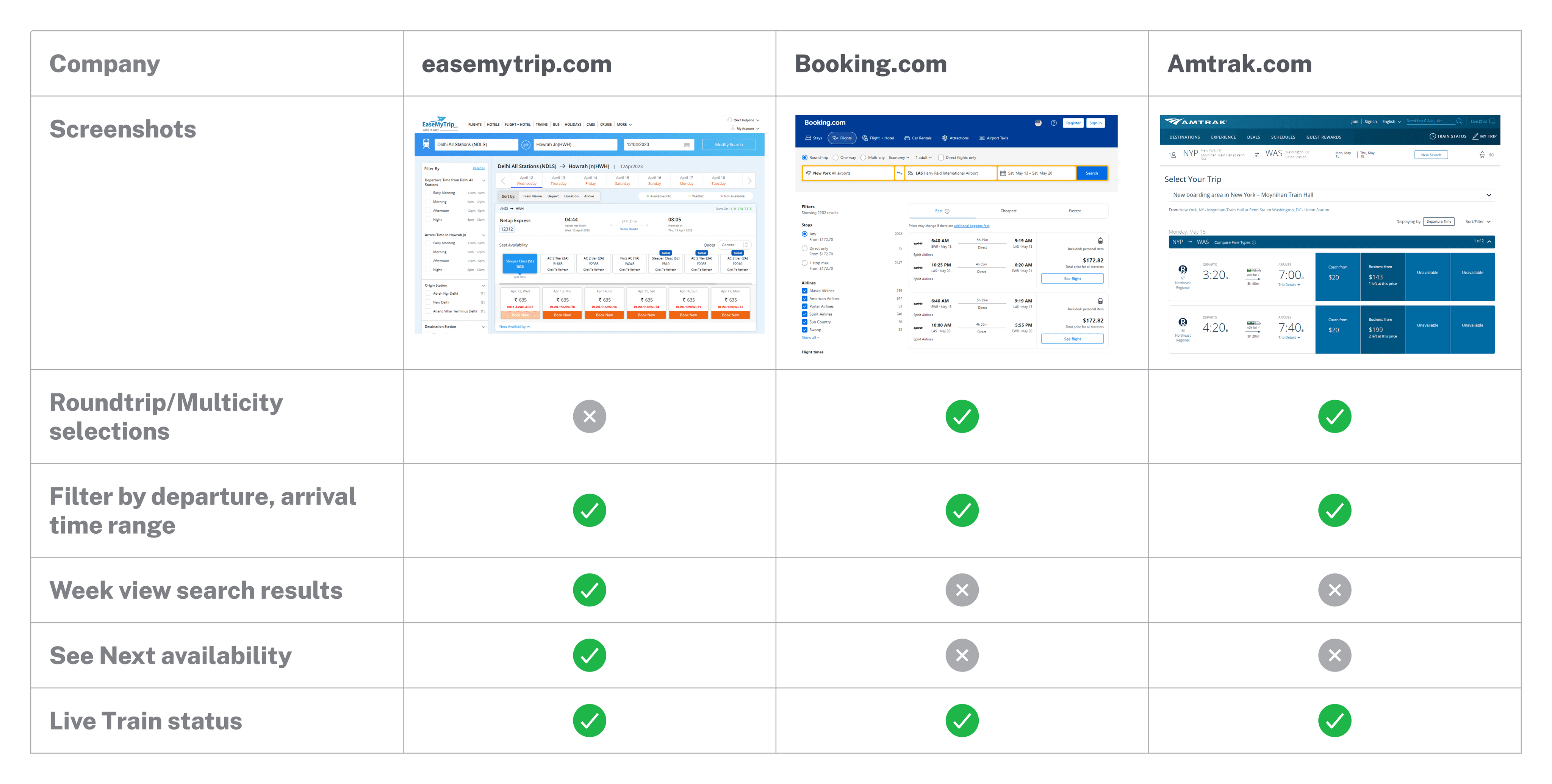
Main Takeaways
A simple UI and easy navigation are key factors for a positive user experience in complex flows like train ticket booking.
Successful features include filtering by time range and suggesting alternate train options when the preferred one is not available.
Evaluate
Identifying Usability Issues
Through a thorough heuristic evaluation of the current website, I successfully identified significant usability issues and potential areas for improvement.
Key Findings
Navigation: The cluttered navigation bar with overloaded information and irrelevant links makes it challenging to locate the required information.
Hierarchy: Too much information on the screens and a lack of clear hierarchy make the layout appear disorganized and increase the cognitive load for the users.
Jargon: Technical jargon related to waiting lists, concessions, and classes, causes uncertainty and complicates the booking process for new users.
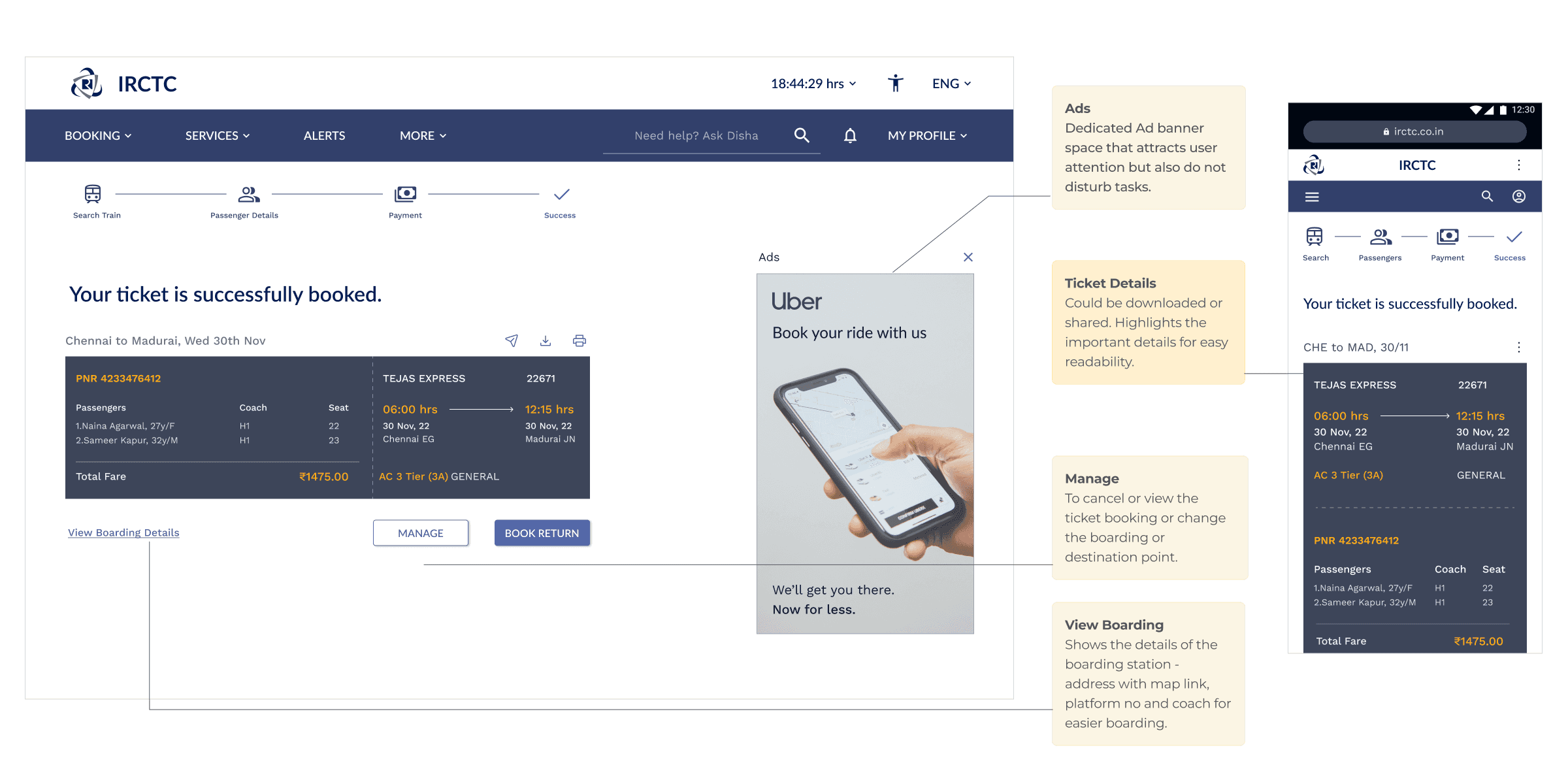
Advertisement: Ads taking priority over the call to action and appearing randomly between tasks leave users feeling stuck and frustrated.
Empathize and Define
Capturing User Perspectives to Inform Design Decisions
With a series of one-on-one interviews with five frequent users of IRCTC, I gained a deeper understanding of their needs, challenges, and pain points regarding their booking experience. Using this, I created a user journey map to identify pain points and areas for improvement across the booking process.
Drawing upon these, I created a primary persona to better understand and represent the target users. Throughout the process, this persona and the journey map played a crucial role in ensuring that design decisions remained closely aligned with user needs.
Constraints and Considerations
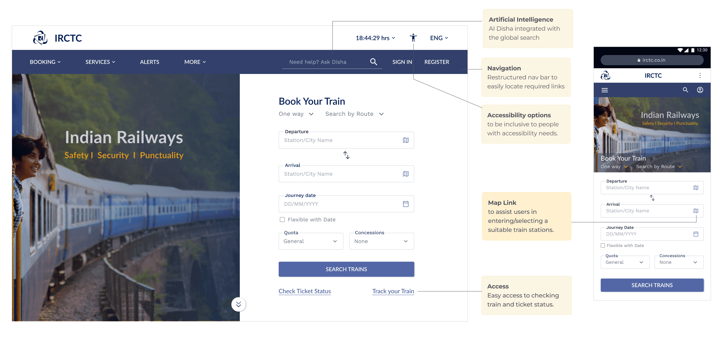
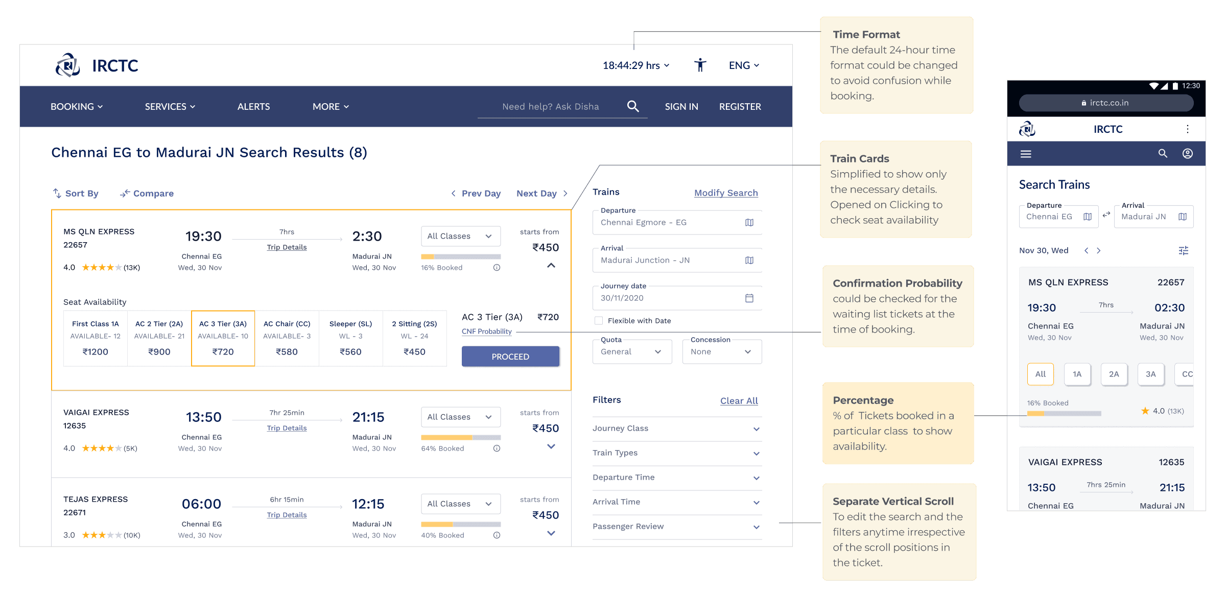
Clarity: Incorporate a map-based selection feature for passengers to choose their departure and arrival stations to address the confusion caused by ambiguous station names.
Transparency: Implementing a review and rating feature for for train performances, including on-time arrival and cleanliness to enhance transparency and inform passenger choices.
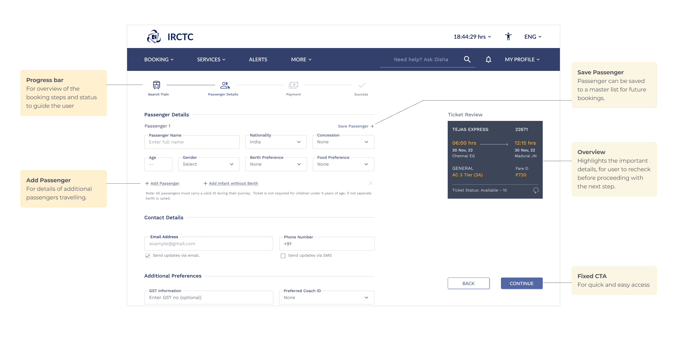
Convenience: Expedite the booking process by enabling the option to save booking details during the reservation, eliminating repetitive data entry, and enhancing convenience.
The Design: From Ideas to Prototype
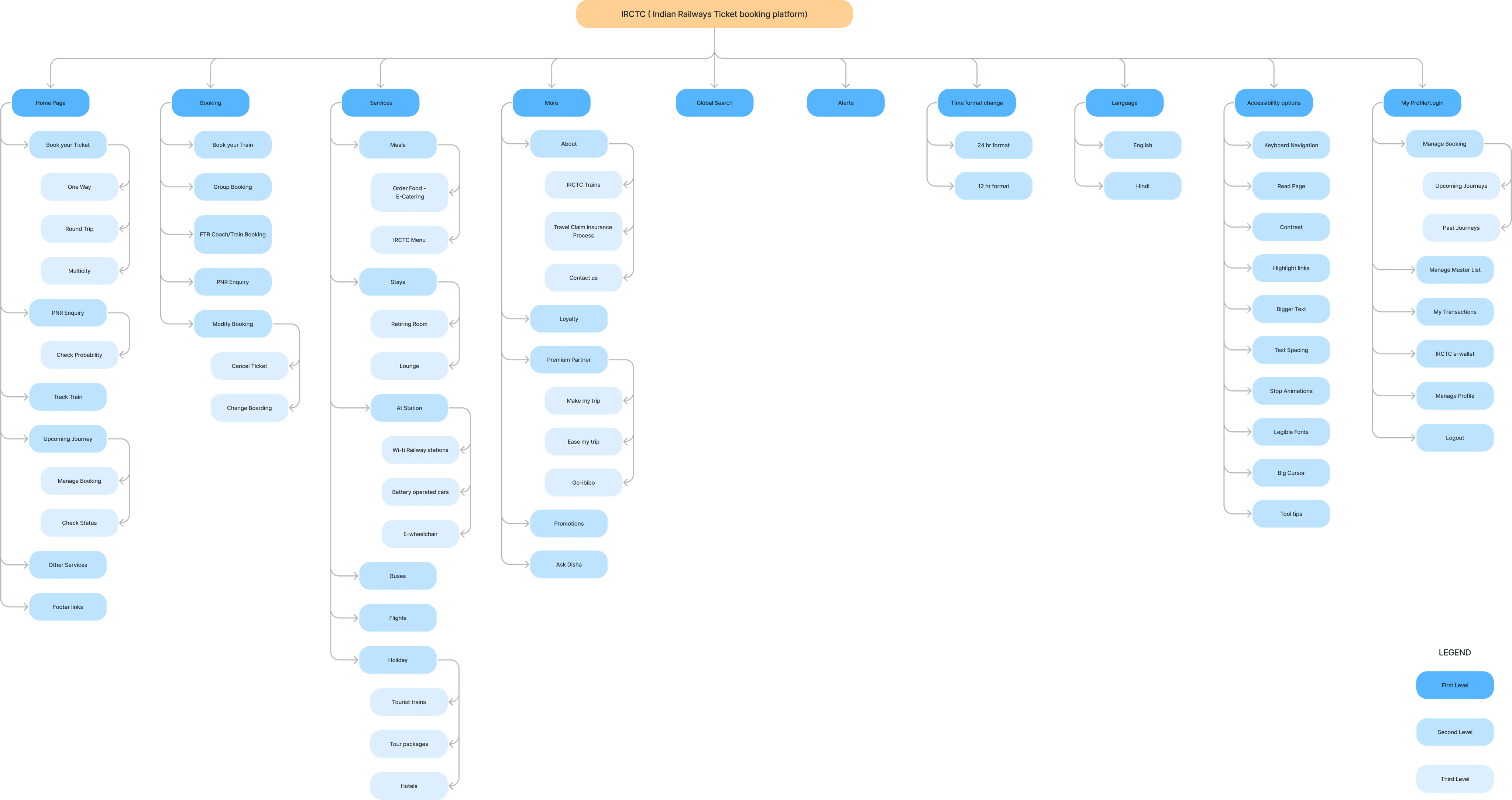
Streamlining Information Architecture
The current website layout could have been more organized, and the navigation options and content needed to be better categorized to access information quickly. I reorganized the website's information architecture to simplify navigation and improve the user experience.
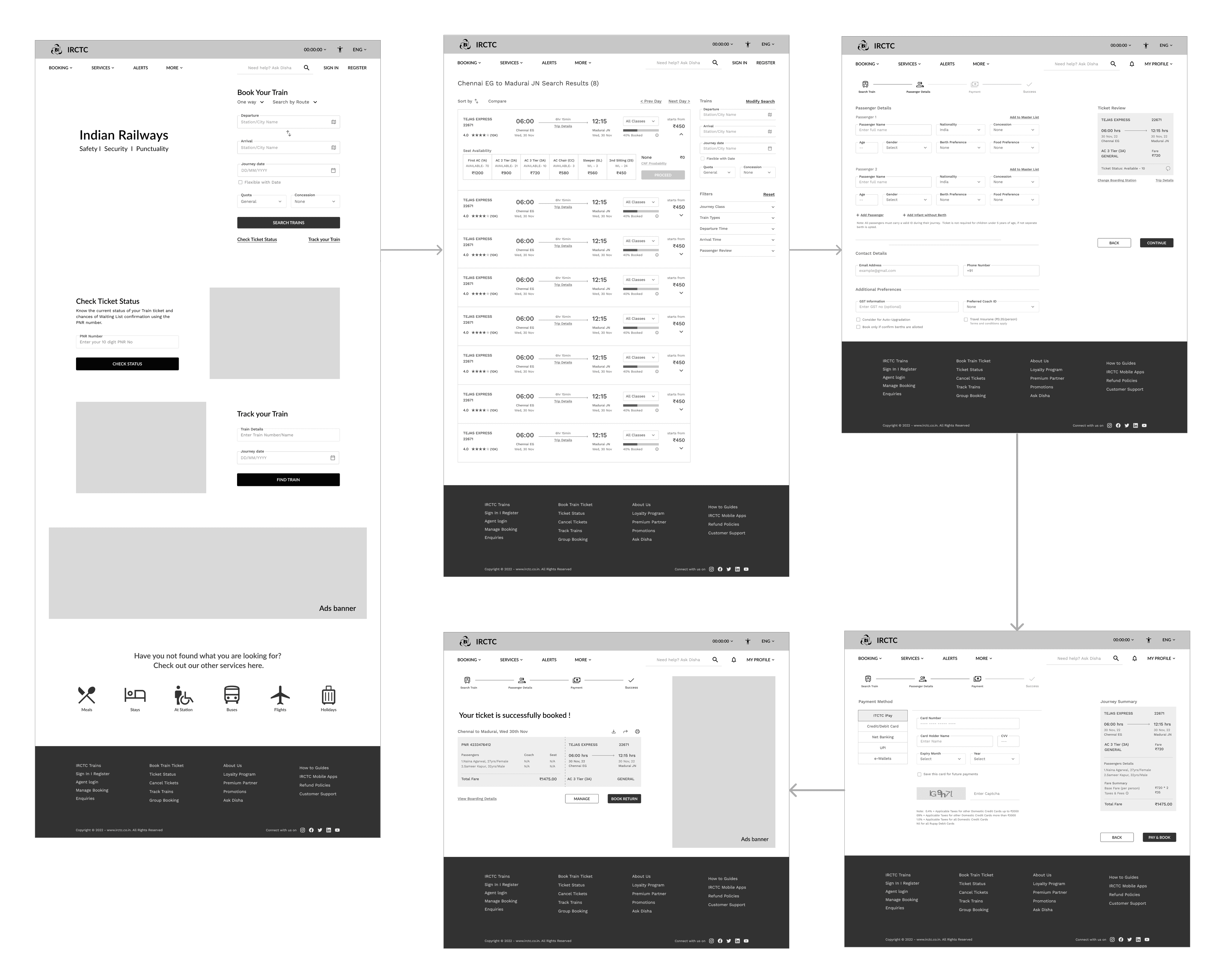
Designing Wireframes
Using the journey map and site map as references, I created a user flow for the ticket booking process, which further enabled me to visualize the user's journey through the website. Based on this, I developed wireframes to design the website's structure and layout while also focusing on the interactions between the elements to ensure a seamless booking flow for the users.
The Look and Feel
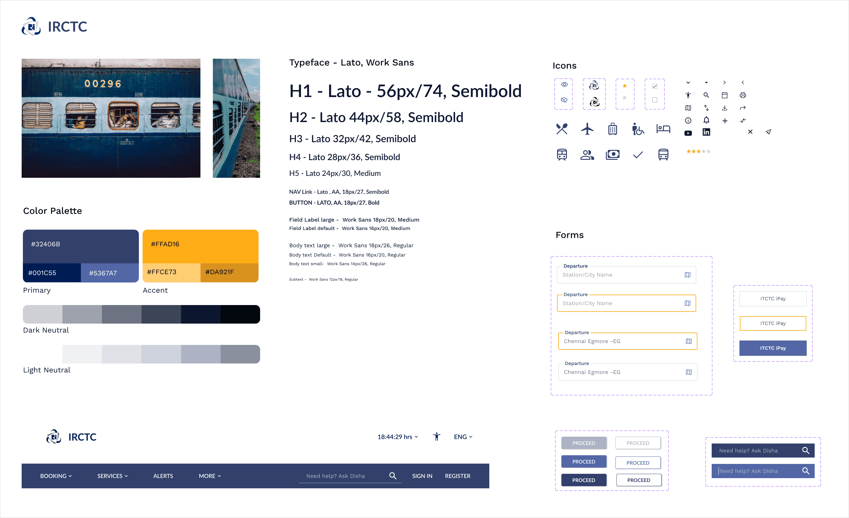
I chose a neutral color palette inspired by the trains in India. A simple style helped highlight necessary details on this content-heavy website
Testing Effectiveness
To ensure the effectiveness of the redesign, I conducted a usability test with five users, including three frequent users and two new users of IRCTC. Based on the feedback collected, I organized the data into a feedback grid and evaluated it to make necessary revisions based on the severity and frequency of the issues.
"I love the new interface. I can't believe how much simpler the booking process has become."
"The ticket layout is much cleaner. I can easily find the important information now."
Embracing Feedback
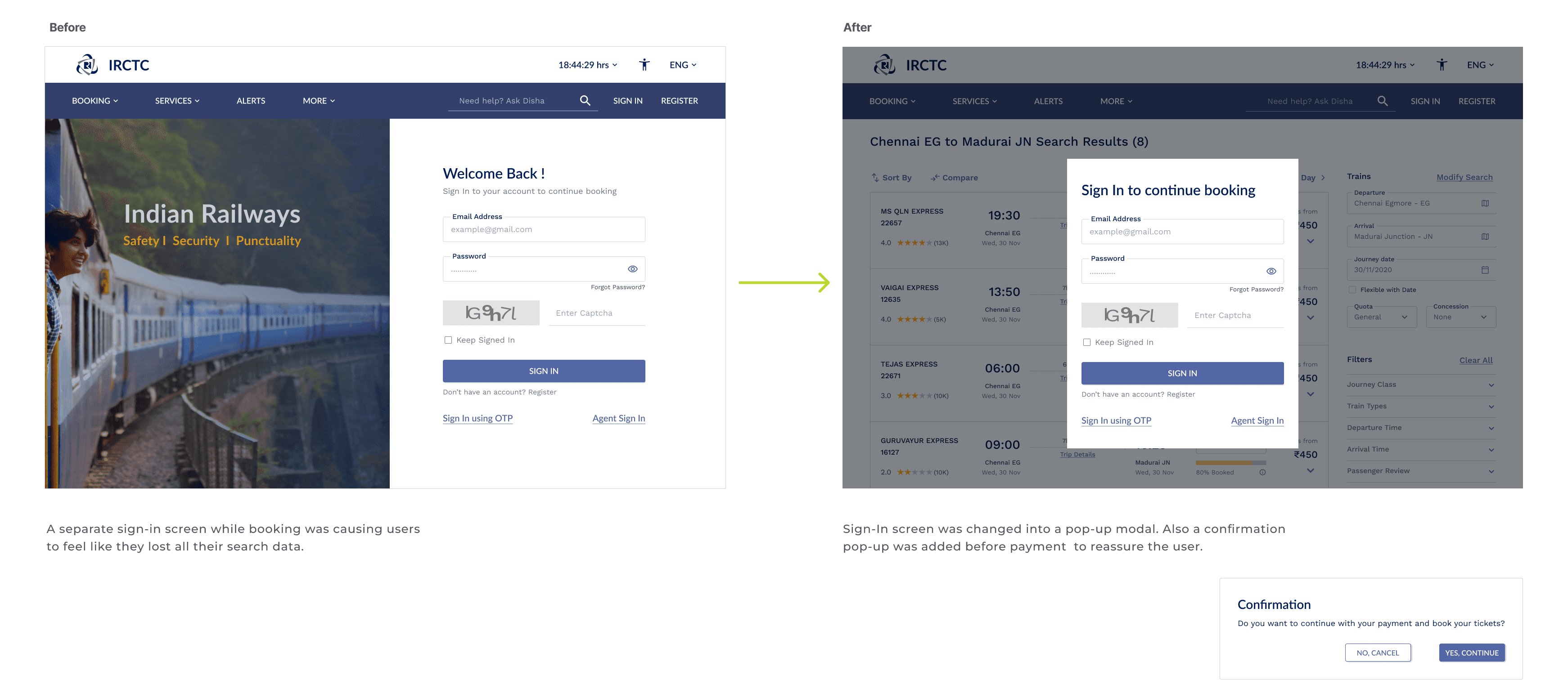
Based on careful analysis of user feedback and utilizing the impact matrix for prioritization, I have implemented the following design iteration.
A separate sign-in screen while booking was causing users to feel like they lost all their search data. So, I changed the sign-in screen into a pop-up modal. Also added a confirmation pop-up before payment to reassure the user.
Reflection
Understanding the existing features and evaluating the site's usability is as crucial as user research. Designing wireframes required simultaneous consideration of both elements on the screen and their interactions, making the project challenging but all the more interesting. Mapping the user decisions in the journey map and the user flow helped me guide my design.
Next steps: If I were to continue on this project, I'd design other task flows like checking the ticket status, tracking trains, and managing existing bookings. Furthermore, I would create prototypes for the mobile version and explore different accessibility options for key screens.
